Hey, y'all!
I hope you've been well and enjoyed your summer.
Fall seemed to come in so aggressively! I wasn't ready!😉
The last time I was on here, I vlogged about the low-cost, high-impact kitchen refresh project in one of my favorite cities, Chicago. It was a refresh, not a reno because there was virtually zero demolition involved.
This refresh was a nail-biter! The budget (well under $10K all in) & timeline (1 month from design to final construction - virtually impossible) were a massive challenge, but the clients were returning collaborators and game to go as bold as the constraints would allow - and that is always a massive plus for a designer! I love it when clients are keen on doing something boundary-pushing. Although the space is a rental apartment, the clients were open to pushing the envelope and doing a black and white kitchen! I've wanted to do a black and white kitchen and or bath for years! So I jumped on this opportunity to go for it!
The timing was the most stressful part of the project since like most homes there's only one kitchen, construction had to happen over 10 days max, while the clients were on holiday. This is a virtually impossible feat, but with detailed planning and communication with my general contractor (the real rockstar of our operations here at Kemi Collective - shout out to Shawn!), we were able to go from design development to construction in a month. Construction took 10 days flat! I still can't believe we got this done in this timeframe!
With a tight budget, as always, I had to make sure to be discerning in my material choices - using materials that are durable, affordable, and low-maintenance...but not boring, never boring 🤌🏾. With the commitment to a black and white kitchen, the goal was to evoke classic, sexy, and warm. Off to the races I went once I'd gotten buy-in from the clients on the overall design direction.
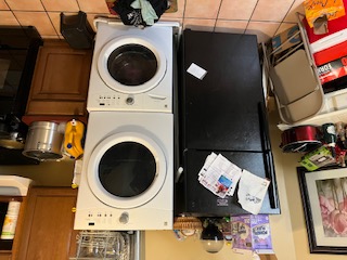
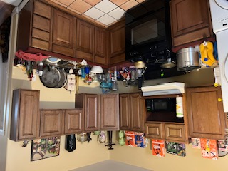
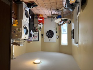
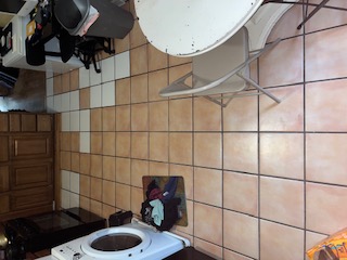
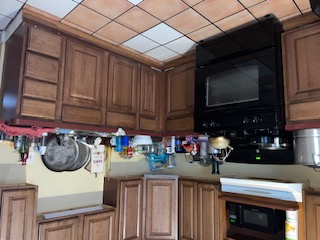
As a reminder, this is where we started...
Challenges: not enough storage, that's why things were bursting at the seams, dated but high-quality cabinetry, washer/dryer unit misplaced, dated flooring, non-existent food venting above range, teeny tiny microwave.
Here's what we did:
New layout - flipping the fridge and washer/dryer improved the functionality of the entire space; a clear case of form following function to great effect
New flooring - the existing flooring was great quality but dated, very dated, and also well installed (read demo would've been a nightmare) so we kept it and put down my fave material, luxury vinyl plank (lvp), right on top of the existing floor! We saved thousands doing this!
New paint - all the walls, even the gas dryer vent, but most impactfully, we painted the cabinets! The cabinets were really good quality but dated, painting them was the cost-effective way to add a ton of impact. I only use Benjamin Moore paints in my projects as they are saturated, easy to use, a little goes a long way, and are uber-durable and wear-well.
New venting microwave - this was a purely functional and necessary addition. Proper food ventilation is imperative to keeping your kitchen paint job lasting. A lot of kitchen refreshes miss this step, then wonder why there's grease and grime on their walls and appliances.
New cabinetry - new cabinetry above the microwave, washer/dryer stack, and fridge. Cabinetry can get expensive, so when I can, I add low-cost unfinished pieces that'll be painted for function (additional storage) and form
(Add symmetry to the space, draw your line of sight to a feature or away from a problem).
New hardware - it's hard to see, but all the cabinets have new hardware. Another functional necessity with an aesthetic payoff. Putting hardware on your cabinetry ensures the durability of your cabinet paint job.
New sink and faucet - the old sink was past its prime and on its last legs! I lean toward one brand - Kraus. They're a bit pricey, but there are certain things I do not skimp on, plumbing is one of them. The only wrinkle was how big this sink was - 33", larger than your typical apartment sink. Sinks and faucets are the jewelry, the bling of a reno/refresh. So although they're a key functional element, they also provide an opportunity for some adventure in a design.
New backsplash tile - my favorite material! Kitchen backsplash is another functional necessity and a tremendous opportunity to create a cohesive and complete design - never skip this material addition! Even if you're using a 'basic' tile (subway), install it in interesting configurations or with unexpected grout. I love tile!
New butcher block countertop - although the existing countertop was highly functional it wasn't aesthetically pleasing and certainly no longer aligned with the new design scheme. It had to go. The budget wouldn't allow for a natural stone countertop, so butcher block it had to be. If you've been picking up what I'm putting down, you'll know that again, just because you're using a 'basic' material, doesn't mean you can't apply it in a new way that aligns with your overall design scheme. Butcher block can read very rustic or country, this design is decidedly contemporary with Scandi touches. To stay in alignment with the overall design aesthetic, the butcher block was white-washed with a food-safe stain. It gave the countertop a white-cast, in keeping with the black and white color scheme. I was best pleased with this result in the entire design. 10/10👏🏾
Phew! Soooo, here is where we landed with all the changes...


I'm so incredibly pleased with the end result! So are the clients and our contractors!
All our projects run on high levels of collaboration and communication. We can't deliver on our commitment to our clients if we don't move with the intention to be transparent and highly collaborative. Like a 90's RnB remix, collabos are our jam!
If you love what we did here on Project 'D' in Chitown and are in need of a space refresh of your own, hit us up! At Kemi Collective we love to transform all your life's spaces!
Cheers!



Comments